Jewish Association of Death Education

New E-Commerce Website
When a brand focuses on educating a community about death practices—before, during and after, it can be a challenge to visualize and also message. We created a brand around rocks, water and the beauty of life. Based on a practice in the Jewish religion, the Hebrew word for pebble is also a word that means “bond.” By placing a stone on the headstone, it bonds the deceased with the visitors. Check out how this brand turned out overall. What feeling do you get? Also, visit www.jadeinfo.org to learn more about this new non-profit organization.
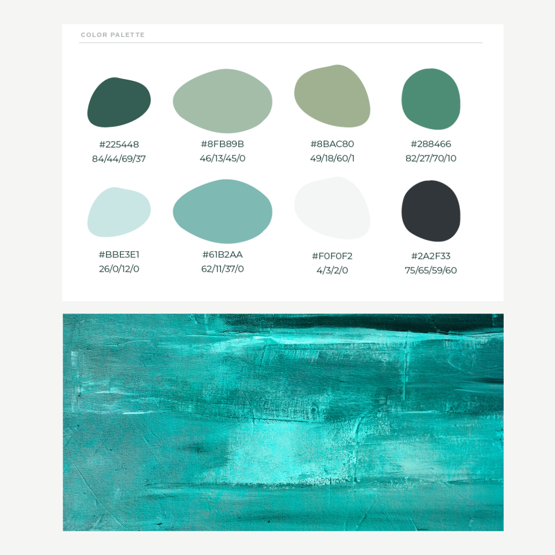
Color Palette
The color palette represented shades of greens and blues. It started with looking at the color jade and expanded from the color Jade into greens, blues, and water-like tones—water is an integral part of Jewish death rituals and practices, so it made sense to incorporate these colors.

Website
Our consumer research revealed insights into what people would want from this entirely new organization—the Jewish Association for Death Education (JADE). From our research, we gained insights that influenced the core services, headlines and messaging that you see in the above website. Visit www.jadeinfo.com
Problem
The journey to develop the Jewish Association for Death Education (JADE) began with a clear recognition of the need for a compassionate, educational resource during the deeply sensitive and challenging times of mourning. Our consumer research and interviews uncovered a profound desire for an organization that could offer solace, understanding, and practical guidance to Jewish individuals grappling with loss. The absence of such a resource highlighted a significant gap in support for the Jewish community and beyond, during one of life's most distressing periods.
Solution
Shubu Creative embarked on an in-depth exploration to understand the needs and expectations of those seeking support in times of loss. This foundational research informed every aspect of our strategy, from content development to service offerings.
With a solid understanding of the community's needs, we crafted a comprehensive brand strategy, laying the groundwork for JADE's core services, messaging, and online presence. This strategy was the blueprint for developing a brand identity that embodied empathy, serenity, and understanding.
We meticulously designed JADE's visual identity to reflect calmness and reassurance, selecting colors and styles that convey a sense of peace. The branding was consistently applied across all touchpoints, ensuring a cohesive and comforting presence.
The creation of the JADE website was the culmination of our efforts, designed to be a digital sanctuary for those in mourning. It serves as a central hub for education, support, and community connection, easily accessible and reflective of JADE's core values.
Impact
The launch of JADE marked a significant step forward in providing targeted support and education for those facing the loss of a loved one. The brand has become a pivotal resource, offering:
Through its calming visual identity and thoughtful content strategy, JADE offers a comforting presence to those in mourning. The JADELINE and core services, easily navigable through the website, ensure that individuals have access to essential resources during their time of need. JADE has fostered a sense of community, providing a platform for shared experiences and support among those who are grieving.
Through strategic insight, creative execution, and a deeply empathetic approach, Shubu Creative has successfully addressed a critical need, creating a lasting impact on individuals and families during their most challenging times.