Jewish Association of Death Education
New E-Commerce Website
When a brand focuses on educating a community about death practices—before, during and after, it can be a challenge to visualize and also message. We created a brand around rocks, water and the beauty of life. Based on a practice in the Jewish religion, the Hebrew word for pebble is also a word that means “bond.” By placing a stone on the headstone, it bonds the deceased with the visitors. Check out how this brand turned out overall. What feeling do you get? Also, visit www.jadeinfo.org to learn more about this new non-profit organization.
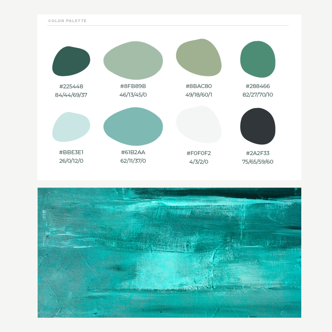
Color Palette
The color palette represented shades of greens and blues. It started with looking at the color jade and expanded from the color Jade into greens, blues, and water-like tones—water is an integral part of Jewish death rituals and practices, so it made sense to incorporate these colors.
Website
Our consumer research revealed insights into what people would want from this entirely new organization—the Jewish Association for Death Education (JADE). From our research, we gained insights that influenced the core services, headlines and messaging that you see in the above website. Visit www.jadeinfo.com
Problem
The journey to develop the Jewish Association for Death Education (JADE) began with a clear recognition of the need for a compassionate, educational resource during the deeply sensitive and challenging times of mourning. Our consumer research and interviews uncovered a profound desire for an organization that could offer solace, understanding, and practical guidance to Jewish individuals grappling with loss. The absence of such a resource highlighted a significant gap in support for the Jewish community and beyond, during one of life's most distressing periods.
Solution
Shubu Creative embarked on an in-depth exploration to understand the needs and expectations of those seeking support in times of loss. This foundational research informed every aspect of our strategy, from content development to service offerings.
With a solid understanding of the community's needs, we crafted a comprehensive brand strategy, laying the groundwork for JADE's core services, messaging, and online presence. This strategy was the blueprint for developing a brand identity that embodied empathy, serenity, and understanding.
We meticulously designed JADE's visual identity to reflect calmness and reassurance, selecting colors and styles that convey a sense of peace. The branding was consistently applied across all touchpoints, ensuring a cohesive and comforting presence.
The creation of the JADE website was the culmination of our efforts, designed to be a digital sanctuary for those in mourning. It serves as a central hub for education, support, and community connection, easily accessible and reflective of JADE's core values.
Impact
The launch of JADE marked a significant step forward in providing targeted support and education for those facing the loss of a loved one. The brand has become a pivotal resource, offering:
Through its calming visual identity and thoughtful content strategy, JADE offers a comforting presence to those in mourning. The JADELINE and core services, easily navigable through the website, ensure that individuals have access to essential resources during their time of need. JADE has fostered a sense of community, providing a platform for shared experiences and support among those who are grieving.
Through strategic insight, creative execution, and a deeply empathetic approach, Shubu Creative has successfully addressed a critical need, creating a lasting impact on individuals and families during their most challenging times.
Homestyle Direct
New E-Commerce Website
ShuBu built and designed a complex e-commerce meal shopping and ordering experience, a multi-level case manager referral form process and integrated it with its CRM system.
The website is Americans with Disabilities Act Standards for Accessible Design compliant. It is tailored and user-friendly for the audience, which includes Healthcare Case Managers and Companies, State Agencies, Adult Children, Medicare Advantage, and Medicare Members!
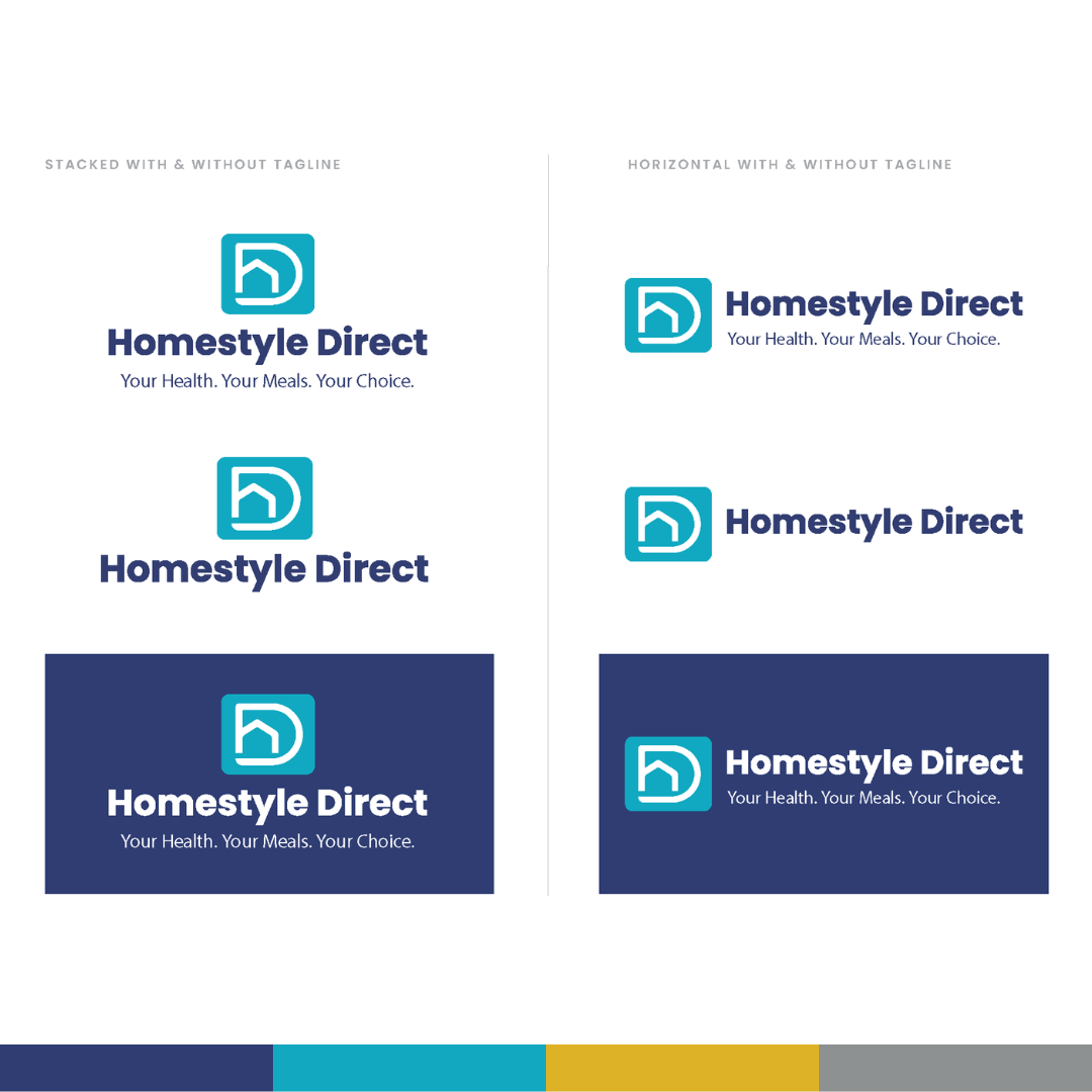
New Logo
The logo is an abstract representation of a house and the feeling of direct meal delivery to the home. The shapes in the logo make up an "H" and a "D" in the name. The tagline represents what Homestyle Direct values and provides its customers, which is a variety of healthy, nutritious, medically tailored meals for Medicaid Advantage and Medicare Members.
New Visual Identity
The visual identity is much more vibrant and user-friendly and also functions better than it did previously! We produced all of the company's collateral, including the new menu, conference materials, sales decks, and more!
Problem
Homestyle Direct recognized the need to evolve its brand to better align with its growing offerings and changing market dynamics—the company had grown from a meal delivery service for the needy into a comprehensive healthcare company offering home-delivered meals to Medicaid Advantage and Medicare members.
The existing brand identity was 26 years old and no longer fully represented the company's full offering, necessitating a comprehensive rebranding. The challenge was to develop new messaging and a visual identity that positioned Homestyle Direct as a healthcare company with many meal choices and meals that were medically tailored to specific disease states - heart disease, renal disease, diabetes, gluten intolerance and other chronic conditions. Additionally, the rebranding had to be implemented across all platforms, including an outdated e-commerce website, to ensure a cohesive and seamless experience for multiple audiences: elderly, adult children, healthcare case managers, state agencies and healthcare companies.
Solution
The initial step involved comprehensive market research to understand industry trends, customer needs, and the competitive landscape. This research laid the foundation for developing a messaging strategy that would resonate with the target audience. The key focus was to hone in on the messaging that accurately reflected the brand's values and offerings. Alongside the messaging refinement, a new visual identity was developed and launched. The visual identity comprised a new logo, colors, supporting graphical elements, iconography, font packages and photography style. Once approved and trademarked, we updated the website design, all social media channels, and email templates to reflect the new brand image and messaging. This also included programming a new e-commerce website (not only frontend design), fully designed to meet the needs of multiple audiences, including a shop for meals, referral forms for case managers and information for state agencies and partners. To ensure effective implementation, training and communication were provided to the internal team on how to use the messaging toolkit and all new sales collateral effectively. This step was crucial to maintaining a unified brand voice across all departments and platforms. Included in the training was lots of new swag given out to employees, including puffer jackets, hoodies, stickers, pens, and more! The final step was launching the campaign to the public via Homestyle Direct’s social media channels, CRM database, and a national press release once the website was fully vetted and tested.
Impact
The rebranding initiative led to several positive outcomes:
Enhanced Brand Perception: The new brand image was more in line with the company's current positioning, enhancing its perception in the market.
Increased Engagement: The updated brand and website attracted higher engagement levels from existing and potential members on its social, email and website.
Brand Consistency: The unified branding across all platforms, including social media and email communication, reinforced brand recognition and trust.
Positive Market Reception: The rebranding was well-received by members, partners, and other stakeholders, affirming the effectiveness of the new brand strategy.
New Campaigns: The new brand has been used in two successful marketing campaigns and will continue to be leveraged for new marketing tactics and campaigns into the future.
This case study underscores the significance of aligning a brand's identity with its strategic objectives and market position. Through careful planning and execution, Homestyle Direct successfully refreshed its brand image, increasing engagement, consistency, and positive reception in the marketplace.
Connected EC
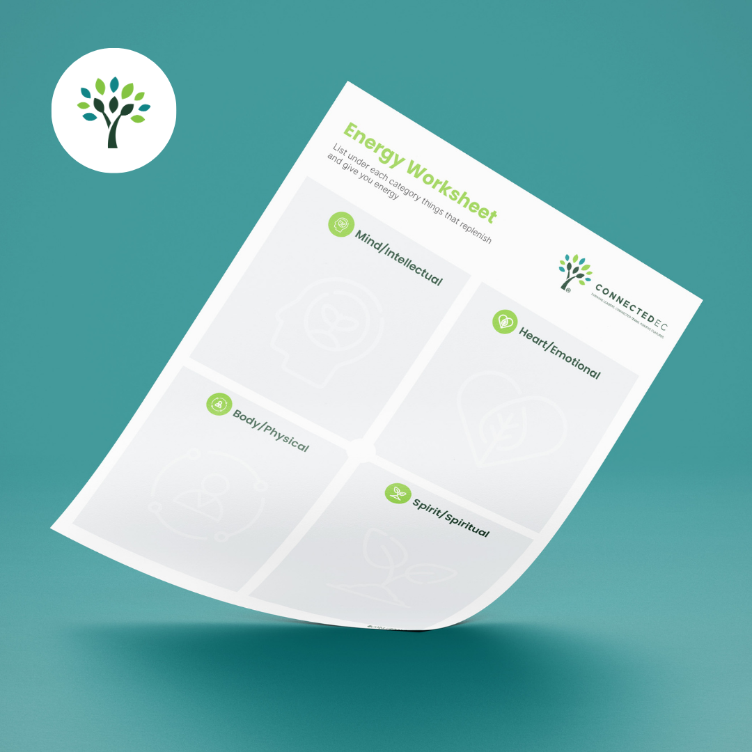
Collateral
All collateral was updated to reflect the brand. The worksheets are available digitally on the new website.
The New Brand
The brand look and feel was based on humanity, connection and vitality to represent leaders, team and organizations thriving.
Photography
The style uses plants, flowers and nature to represent growth vs. what is expected: corporate people and stock.
Social Media Templates
A variety of social media templates were made to enhance the captions used for value-driven posts on Linkedin targeted to leaders, teams, organizations, researchers and coaches.
Color Palette
Greens, earth tones and blues to represent vitality, growth, thriving and positivity.
Problem
Connected EC, a 12-year-old leadership coaching firm at the time of rebranding, had evolved over the years and faced challenges communicating its services and unique value proposition. Their website was intended to attract more executive coaches and clients (large corporations and organizations), but very few understood what the company did. Additionally, they needed assistance positioning themselves as an authority in the industry and increasing their visibility among positive organizational psychologists, researchers, and corporations worldwide. This was a huge issue because its value proposition, core services, mission, and vision were unclear, preventing them from scaling and reaching their goals.
Solution
ShuBu Creative addressed challenges faced by Connected EC by defining its core services, focusing on leadership, teams, and organizations, and creating a tagline, "CREATE THRIVING LEADERS, CONNECTED TEAMS, AND POSITIVE CULTURES." They modernized the brand's look with vitality-inspired colors and graphics. ShuBu also developed a digital content strategy, monthly social media posts, and earned media, enhancing brand awareness and credibility. Their content covers wellbeing, leadership, burnout, vitality, and positive organizational psychology while maintaining a consistent visual identity.
Impact
The partnership with ShuBu Creative has transformed Connected EC, propelling its growth and enhancing its market visibility. The rebranding initiative, which more effectively communicated the company's core functions, coincided with a doubling in revenue in the same year. This success was further augmented by the expansion of the coaching team and significant media coverage in CEO Global Magazine, Colorado Biz Magazine, various blogs and podcasts, and local news stations.
The impact of the launch of a robust digital content strategy was immediate and substantial. Within just five months, Connected EC's LinkedIn presence surged by 1000%, drawing the attention of academics and corporations globally. This increased exposure, coupled with a more impactful brand presence and broader reach, is a testament to the effectiveness of the rebranding.
Overall, the collaboration with ShuBu Creative not only elevated Connected EC's brand positioning but also played a crucial role in its rapid scale-up and success in the industry. The company's revised messaging, overhauled website, and strategic digital content approach were key drivers in this remarkable growth trajectory.
Latitude40 Real Estate Group
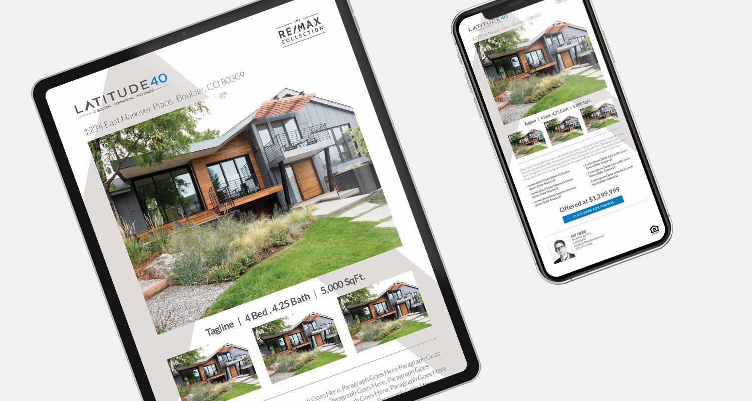
Bringing this 20-year in the making brand to life has been an honor. Every detail is the ideation of the founder himself, Jay Hebb. From helping Jay name his brokerage, to creating signage and finding unique ways to represent his investment, development and residential real estate portfolio with the utmost integrity has been key to developing the Latitute40 brand.


