
Jewish Association of Death Education

New E-Commerce Website
When a brand focuses on educating a community about death practices—before, during and after, it can be a challenge to visualize and also message. We created a brand around rocks, water and the beauty of life. Based on a practice in the Jewish religion, the Hebrew word for pebble is also a word that means “bond.” By placing a stone on the headstone, it bonds the deceased with the visitors. Check out how this brand turned out overall. What feeling do you get? Also, visit www.jadeinfo.org to learn more about this new non-profit organization.
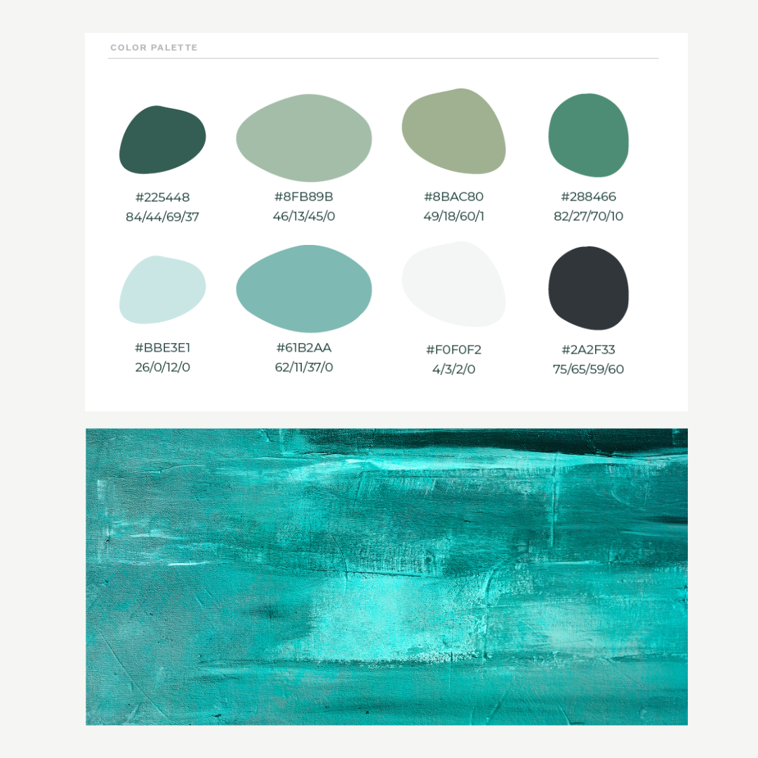
Color Palette
The color palette represented shades of greens and blues. It started with looking at the color jade and expanded from the color Jade into greens, blues, and water-like tones—water is an integral part of Jewish death rituals and practices, so it made sense to incorporate these colors.

Website
Our consumer research revealed insights into what people would want from this entirely new organization—the Jewish Association for Death Education (JADE). From our research, we gained insights that influenced the core services, headlines and messaging that you see in the above website. Visit www.jadeinfo.com
Problem
The journey to develop the Jewish Association for Death Education (JADE) began with a clear recognition of the need for a compassionate, educational resource during the deeply sensitive and challenging times of mourning. Our consumer research and interviews uncovered a profound desire for an organization that could offer solace, understanding, and practical guidance to Jewish individuals grappling with loss. The absence of such a resource highlighted a significant gap in support for the Jewish community and beyond, during one of life's most distressing periods.
Solution
Shubu Creative embarked on an in-depth exploration to understand the needs and expectations of those seeking support in times of loss. This foundational research informed every aspect of our strategy, from content development to service offerings.
With a solid understanding of the community's needs, we crafted a comprehensive brand strategy, laying the groundwork for JADE's core services, messaging, and online presence. This strategy was the blueprint for developing a brand identity that embodied empathy, serenity, and understanding.
We meticulously designed JADE's visual identity to reflect calmness and reassurance, selecting colors and styles that convey a sense of peace. The branding was consistently applied across all touchpoints, ensuring a cohesive and comforting presence.
The creation of the JADE website was the culmination of our efforts, designed to be a digital sanctuary for those in mourning. It serves as a central hub for education, support, and community connection, easily accessible and reflective of JADE's core values.
Impact
The launch of JADE marked a significant step forward in providing targeted support and education for those facing the loss of a loved one. The brand has become a pivotal resource, offering:
Through its calming visual identity and thoughtful content strategy, JADE offers a comforting presence to those in mourning. The JADELINE and core services, easily navigable through the website, ensure that individuals have access to essential resources during their time of need. JADE has fostered a sense of community, providing a platform for shared experiences and support among those who are grieving.
Through strategic insight, creative execution, and a deeply empathetic approach, Shubu Creative has successfully addressed a critical need, creating a lasting impact on individuals and families during their most challenging times.

Homestyle Direct

New E-Commerce Website
ShuBu built and designed a complex e-commerce meal shopping and ordering experience, a multi-level case manager referral form process and integrated it with its CRM system.
The website is Americans with Disabilities Act Standards for Accessible Design compliant. It is tailored and user-friendly for the audience, which includes Healthcare Case Managers and Companies, State Agencies, Adult Children, Medicare Advantage, and Medicare Members!
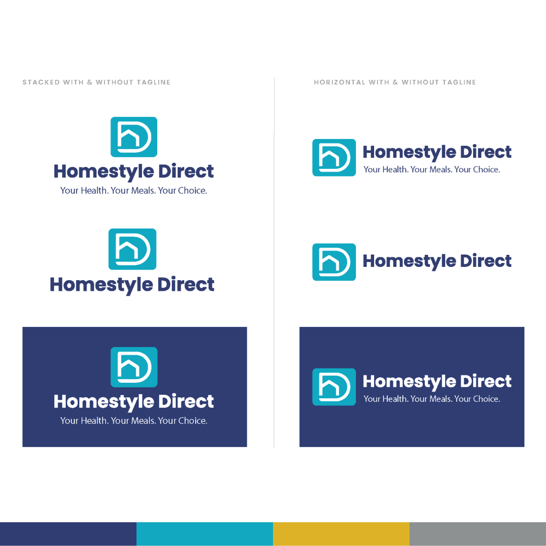
New Logo
The logo is an abstract representation of a house and the feeling of direct meal delivery to the home. The shapes in the logo make up an "H" and a "D" in the name. The tagline represents what Homestyle Direct values and provides its customers, which is a variety of healthy, nutritious, medically tailored meals for Medicaid Advantage and Medicare Members.

New Visual Identity
The visual identity is much more vibrant and user-friendly and also functions better than it did previously! We produced all of the company's collateral, including the new menu, conference materials, sales decks, and more!


Problem
Homestyle Direct recognized the need to evolve its brand to better align with its growing offerings and changing market dynamics—the company had grown from a meal delivery service for the needy into a comprehensive healthcare company offering home-delivered meals to Medicaid Advantage and Medicare members.
The existing brand identity was 26 years old and no longer fully represented the company's full offering, necessitating a comprehensive rebranding. The challenge was to develop new messaging and a visual identity that positioned Homestyle Direct as a healthcare company with many meal choices and meals that were medically tailored to specific disease states - heart disease, renal disease, diabetes, gluten intolerance and other chronic conditions. Additionally, the rebranding had to be implemented across all platforms, including an outdated e-commerce website, to ensure a cohesive and seamless experience for multiple audiences: elderly, adult children, healthcare case managers, state agencies and healthcare companies.
Solution
The initial step involved comprehensive market research to understand industry trends, customer needs, and the competitive landscape. This research laid the foundation for developing a messaging strategy that would resonate with the target audience. The key focus was to hone in on the messaging that accurately reflected the brand's values and offerings. Alongside the messaging refinement, a new visual identity was developed and launched. The visual identity comprised a new logo, colors, supporting graphical elements, iconography, font packages and photography style. Once approved and trademarked, we updated the website design, all social media channels, and email templates to reflect the new brand image and messaging. This also included programming a new e-commerce website (not only frontend design), fully designed to meet the needs of multiple audiences, including a shop for meals, referral forms for case managers and information for state agencies and partners. To ensure effective implementation, training and communication were provided to the internal team on how to use the messaging toolkit and all new sales collateral effectively. This step was crucial to maintaining a unified brand voice across all departments and platforms. Included in the training was lots of new swag given out to employees, including puffer jackets, hoodies, stickers, pens, and more! The final step was launching the campaign to the public via Homestyle Direct’s social media channels, CRM database, and a national press release once the website was fully vetted and tested.
Impact
The rebranding initiative led to several positive outcomes:
Enhanced Brand Perception: The new brand image was more in line with the company's current positioning, enhancing its perception in the market.
Increased Engagement: The updated brand and website attracted higher engagement levels from existing and potential members on its social, email and website.
Brand Consistency: The unified branding across all platforms, including social media and email communication, reinforced brand recognition and trust.
Positive Market Reception: The rebranding was well-received by members, partners, and other stakeholders, affirming the effectiveness of the new brand strategy.
New Campaigns: The new brand has been used in two successful marketing campaigns and will continue to be leveraged for new marketing tactics and campaigns into the future.
This case study underscores the significance of aligning a brand's identity with its strategic objectives and market position. Through careful planning and execution, Homestyle Direct successfully refreshed its brand image, increasing engagement, consistency, and positive reception in the marketplace.

Connected EC
Collateral
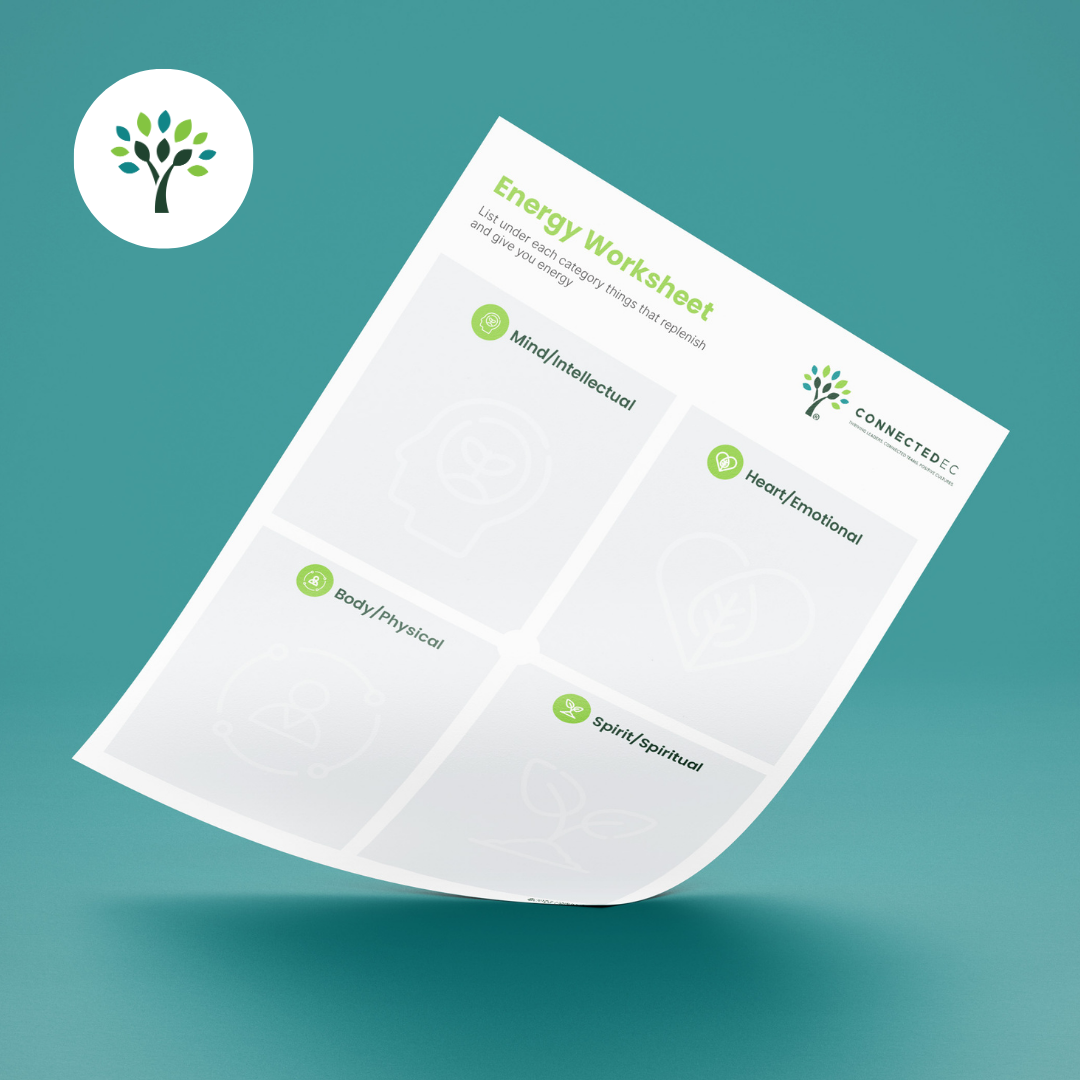
All collateral was updated to reflect the brand. The worksheets are available digitally on the new website.
The New Brand
The brand look and feel was based on humanity, connection and vitality to represent leaders, team and organizations thriving.

Photography
The style uses plants, flowers and nature to represent growth vs. what is expected: corporate people and stock.

Social Media Templates
A variety of social media templates were made to enhance the captions used for value-driven posts on Linkedin targeted to leaders, teams, organizations, researchers and coaches.

Color Palette
Greens, earth tones and blues to represent vitality, growth, thriving and positivity.
Problem
Connected EC, a 12-year-old leadership coaching firm at the time of rebranding, had evolved over the years and faced challenges communicating its services and unique value proposition. Their website was intended to attract more executive coaches and clients (large corporations and organizations), but very few understood what the company did. Additionally, they needed assistance positioning themselves as an authority in the industry and increasing their visibility among positive organizational psychologists, researchers, and corporations worldwide. This was a huge issue because its value proposition, core services, mission, and vision were unclear, preventing them from scaling and reaching their goals.
Solution
ShuBu Creative addressed challenges faced by Connected EC by defining its core services, focusing on leadership, teams, and organizations, and creating a tagline, "CREATE THRIVING LEADERS, CONNECTED TEAMS, AND POSITIVE CULTURES." They modernized the brand's look with vitality-inspired colors and graphics. ShuBu also developed a digital content strategy, monthly social media posts, and earned media, enhancing brand awareness and credibility. Their content covers wellbeing, leadership, burnout, vitality, and positive organizational psychology while maintaining a consistent visual identity.
Impact
The partnership with ShuBu Creative has transformed Connected EC, propelling its growth and enhancing its market visibility. The rebranding initiative, which more effectively communicated the company's core functions, coincided with a doubling in revenue in the same year. This success was further augmented by the expansion of the coaching team and significant media coverage in CEO Global Magazine, Colorado Biz Magazine, various blogs and podcasts, and local news stations.
The impact of the launch of a robust digital content strategy was immediate and substantial. Within just five months, Connected EC's LinkedIn presence surged by 1000%, drawing the attention of academics and corporations globally. This increased exposure, coupled with a more impactful brand presence and broader reach, is a testament to the effectiveness of the rebranding.
Overall, the collaboration with ShuBu Creative not only elevated Connected EC's brand positioning but also played a crucial role in its rapid scale-up and success in the industry. The company's revised messaging, overhauled website, and strategic digital content approach were key drivers in this remarkable growth trajectory.

Butterfly Rising Institute
Problem
Butterfly Rising Institute, an organization dedicated to empowering and supporting single mothers, faced challenges with its outdated website, unclear messaging, and unrefined branding. They needed help to effectively communicate their mission, connect with their target audience, and secure partnerships with notable groups.
Solution
ShuBu Creative partnered with Butterfly Rising Institute to revamp its brand and online presence. Through a collaborative process, ShuBu Creative identified the key issues and devised a comprehensive solution.
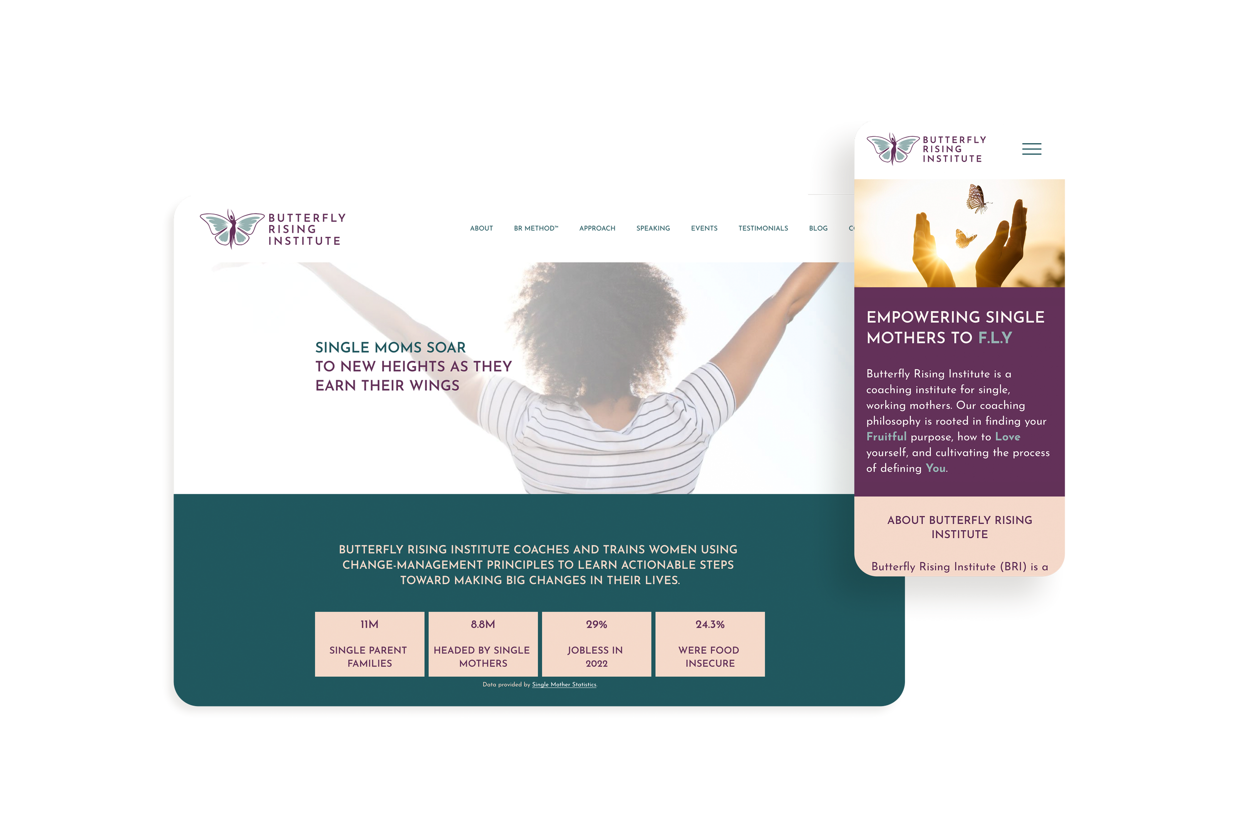
Website Redesign: ShuBu Creative developed a visually appealing and user-friendly website for Butterfly Rising Institute. The new website showcased its mission, programs, and success stories compellingly, creating a seamless user experience.
Logo Refinement: ShuBu Creative refined Butterfly Rising Institute's logo to align with its vision and values. The updated logo captured the essence of transformation, resilience, and empowerment, visually representing their mission.
Clear Messaging: ShuBu Creative worked closely with Butterfly Rising Institute to craft clear and impactful messaging. They refined the organization's brand story, mission statement, and program descriptions to communicate their value proposition to potential partners and single mothers.
Impact
The collaboration between ShuBu Creative and Butterfly Rising Institute resulted in significant positive outcomes:
City Program Partnerships & Workshops: Through the brand transformation, Butterfly Rising Institute secured a partnership with the City of Denver Wellness Program. This partnership allowed them to offer their 8-week program for single mothers to a broader audience, enhancing their reach and impact. This improved visibility attracted the attention of other notable groups, leading to more partnerships and collaborations that further expanded their influence.
Enhanced Clarity and Engagement: The clear messaging developed by ShuBu Creative resonated with single mothers and critical stakeholders. It helped prospective participants understand the value of the 8-week program, leading to increased enrollment and active engagement within the community.
Public Relations Coverage: Butterfly Rising Institute has been featured in various podcasts, blogs, trade pubs and more due to ShuBu’s ongoing public relations efforts to increase brand awareness.
Overall, ShuBu Creative's strategic approach to branding and messaging revitalized Butterfly Rising Institute's image, enabling them to make a meaningful impact on the lives of single mothers. By providing a compelling online presence, refined logo, and clear messaging, ShuBu Creative empowered Butterfly Rising Institute to reach its target audience, forge valuable partnerships, and foster positive change in the community.

Epilectra, A Graphic Novel Series

Problem
Author and creator of Epilectra, Sue Seserman, came to ShuBu Creative with the brilliant concept of a team of superheroes with disabilities transforming their disabilities into superabilities. The script of a graphic novel series was hand-drawn and presented in a spiral-bound notebook. Sue and her husband, Doug, a marketing professional, knew that this book had a promising future and a vital message to spread. First, however, they wanted help getting it launched and looking professional.
Solution
We worked with Sue to narrow down the key brand pillars of her novel and visually develop the characters in a digitized way. We solidified a clear mission, vision and values as well as a tagline for the book: Transforming Disability into Superability. We determined how to position the book for preteens, parents, and loved ones of those with disabilities. We worked with Sue to hire an illustrator that fit the needs, vision, and style. Once we found the right designer, we went to work.
We've been working for nine months on developing the characters, the storyboards, and the brand messaging pillars. Once we determined the characters and the brand messaging, we created a website, media kit and other marketing materials to support Sue, like business cards and talking points to bring to conferences. At the same time, Sue worked on building a social media presence, followers and general disability awareness.
All the while, we have also implemented an ongoing monthly e-newsletter to Sue’s growing database of contacts as well as a monthly blog post to keep audiences engaged while we wait for the book to publish.
Impact
Sue has grown her audience to thousands of followers on Linkedin, FB, Instagram and Twitter from ground zero. She has gotten endorsements from associations such as the National Epilepsy Foundation and has been interviewed by other industry publications. She even participated in a book publishing contest in Las Vegas, and made it to the top SIX contestants out of 17 for her book pitch. Sue continues to gain awareness of this critical topic. The book was signed with a publisher and is due to hit the market in 2024, so stay tuned!

The Reserve at Lone Tree


It's always a unique challenge to create a house of brands. Experience Senior Living develops senior housing communities across the country. Their newest community, The Reserve in Lone Tree, will break the mold of traditional seniors housing communities, allowing residents, families and team members to experience luxury living together.
Leveraging a strategy mimicking the hotel house of brands Bonvoy Marriot, we developed three brand identities that encompass forward-thinking experiences in senior living: The Reserve, The Gallery and Sancerre, all under the family of Experience Senior Living communities across the country.
We created the Experience Senior Living umbrella brand first to house varying levels of innovative housing for seniors from affordable, premium to luxury.
Check out The Reserve and be on the lookout for more communities to follow!

Sun Life Health
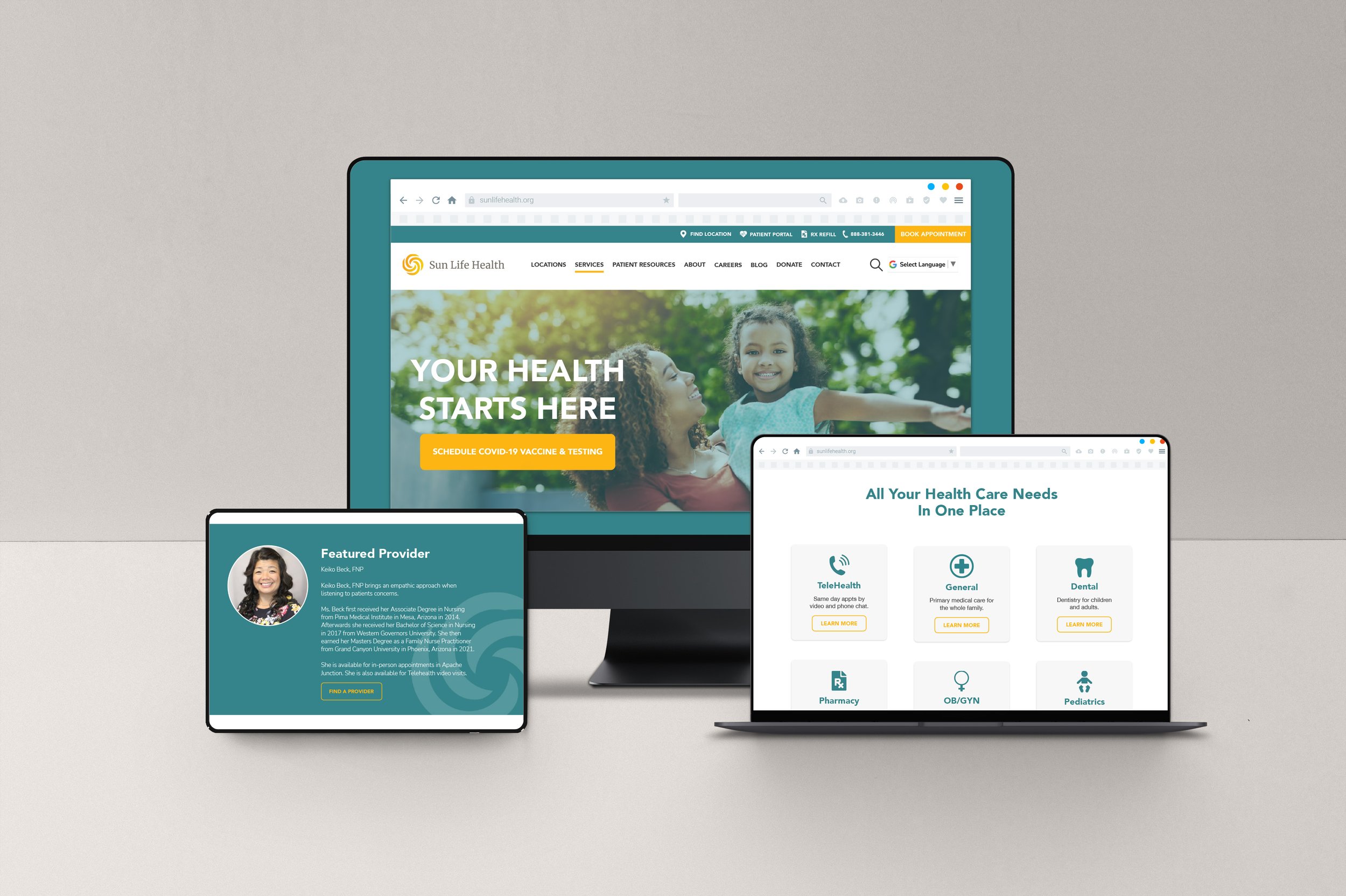
Problem
Sun Life Health (SLH) is a quality healthcare network and provider in Pinal County, Arizona. Their resources and reputation have grown over the last 45+ years and they came to ShuBu Creative to update their brand and messaging to better reflect who they are in today’s market. After a deep analysis, we discovered several key areas in need of alignment for both consistency and clarity.
We found that they had inconsistent branding across service lines, different naming conventions and slightly varying logos at their various locations. In fact, we determined that the logo and colors were very similar to Walmart’s branding, which ultimately translated to a discount feel in the consumer’s eye and did not show the depth and breadth of what they offered— top quality healthcare.
Through focus groups and our signature interview process, it was revealed that the word 'center,' which appeared in all their service lines, had different meanings to prospective patients. Finally, we found very little diversity in their marketing assets despite locations in very diverse areas.
Solution
We began by renaming Sun Life Family Healthcare Center to Sun Life Health. Next, we created a brand and visual identity to reflect that they are quality, reputable healthcare providers for everyone, regardless of race, age or socio-economic status. We updated the color palette to a brighter, more modern aesthetic- one unique to SLH. In addition to redesigning the logo to mark a sun moving in a circle, symbolizing innovative patient-centric care, we also changed all of their brand and marketing photography to be more inclusive and diverse. Finally, we launched a new messaging platform with more engaging, value-driven language to ensure connection with the audience.
Impact
Sun Life Health now has solid brand guidelines and consistent branding across all channels. Since the re-brand, the organization has received several community recognitions, federal grants and awards. It’s been nearly six months since the launch, and reports show an increase in awareness in the community by the volume of phone calls and appointments being made. It has also made recruiting easier, there have been fewer recruiting issues since redesigning the brand and website.

Youth Healthcare Alliance

Problem
The Colorado Association of School-Based Health Care (CASBHC) faced challenges in effectively communicating its mission, services, and impact to its target audience. The organization's previous name, branded as an acronym CASBHC was confusing, making it difficult to differentiate themselves from hundreds of other Colorado health-based organizations and make new legislators (their primary audience) aware of their cause, which equals more funding for school-based healthcare clinics.
Solution
CASBHC partnered with ShuBu Creative to lead its rebranding strategy. Collaborating closely with the Executive Director, staff, and board, ShuBu Creative embarked on a comprehensive branding process to redefine the organization's identity and develop a compelling brand narrative.
ShuBu Creative began by facilitating brainstorming sessions and conducting in-depth interviews to gain insights into the organization's values, goals, and target audience. Through this collaborative process, a new name, "Youth Health Care Alliance," was chosen to reflect the organization's mission better and focus. The tagline, "Champions for Colorado School-Based Clinics," was also developed to succinctly convey the organization's dedication to advancing healthcare access for youth.
To further strengthen the brand, ShuBu Creative refined the brand power words to encapsulate the organization's services: "Advocacy, Advancement, Access, and Equity." These words became the pillars of the brand, representing the core values and impact of the Youth Health Care Alliance.
Impact
The rebranding efforts led by ShuBu Creative had a significant impact on the Youth Health Care Alliance. The organization's new brand narrative now effectively communicates its purpose of improving healthcare outcomes for youth in Colorado. The refined brand power words provide a clear framework for the organization's work and resonate with its stakeholders.
The visual identity of the brand was also transformed to reflect a youthful yet sophisticated image. ShuBu Creative designed modern iconography and selected vibrant colors that captured the attention of the target audience, creating a visually appealing and engaging brand presence.
With the successful rebranding, the Youth Health Care Alliance experienced several positive outcomes. The organization's new name and tagline helped position itself as a leader and advocate for school-based clinics in Colorado. The clear and concise brand messaging improved communication with stakeholders and increased awareness of the organization's services.
The impact of the rebranding efforts extended beyond the visual identity. The Youth Health Care Alliance witnessed enhanced recognition and engagement from key stakeholders, including school administrators, healthcare providers, and policymakers. The organization's revitalized brand presence and narrative attracted new partnerships and funding opportunities, further fueling its ability to advocate for accessible and equitable healthcare for youth.
To learn more about the Youth Health Care Alliance and its impactful work, visit their website at www.youthhealthcarealliance.org.

Vannin Chief of Staff

Problem
Formally known as Vannin Consulting, their name and brand did not clearly explain the benefit of what they deliver. They also needed an elevated brand to reflect their growth better.
Solution
Meet Vannin Chief of Staff.
We changed their name to Vannin Chief of Staff to be more specific. We made their brand more engaging and inclusive, with diverse and bold illustrations.
We also improved their messaging, mission, vision, and values and updated their logo and visual identity to be relevant and modern.
Impact
Vannin Chief of Staff worked with us to implement a marketing plan, including social media, pitch decks and public relations. Since the rebrand, they have seen their followers increase from almost nothing on Linkedin to now more than 600 and growing. They also have increased their revenue threefold over two years, been written up in Forbes and recognized globally by other publications.

Mikvah of East Denver

Problem
A unique development was coming to the Jewish Community in Denver—this project entailed developing a brand for a Mikvah 'coming soon to Denver. While the Mikvah was not operational, the goal was to raise enough money to sustain construction.
Therefore, we need a strong brand that catches high-end donors' attention.
Solution
While being built, we developed a strategy to promote the construction project and gain awareness in the community with a vibrant and relevant visual identity and messaging system. The messaging was open to anyone and education-focused, while the visual identity needed to be fresh and modern.
Impact
The brand reflected a water-like feel derived from what a Mikvah is for the Jewish community. The dots resembled a Jewish star within the design, which was modern and catchy. In addition, a watercolorist enhanced the brand by texturing the renderings and photographs, giving the entire brand an elevated and classy feel.
We helped a 20-year in the making vision come to life and launch in six months. Now, the Mikvah not only raised $250 Million in the capital, but they are also up and running now and serving the Jews in Denver and surrounding areas.

EAU, CPA

Problem
We did a completely new brand for EAU, CPA—a new CPA firm in Denver. From the ground up, we wanted to create a brand that showcased Beth's approachable and cool personality, sophistication, and also years of experience.
Solution
EAU CPA is a full-service accounting firm providing accounting, tax and advisory services focused on providing outstanding customer service. EAU's goal is to help small business owners focus on what they do best - run their business! The brand is focused on three words and pillars that represented Beth's unique attributes. By doing customer interviews we found she is "experienced, approachable, and understanding." We also tied in her love for basketball and the fact that she is a basketball referee for disabled adults by taking photos of Beth with her basketball and referee shirt and tied in some. headlines, such as "Raising the Bar for You and Your Business," with basketball photos. Check out her website and brand by clicking below!
Impact
EAU is a thriving business and the owner says she gets compliments all the time on her website. Her business has had no issue with marketing and branding and is taking off!
Latitude40 Real Estate Group
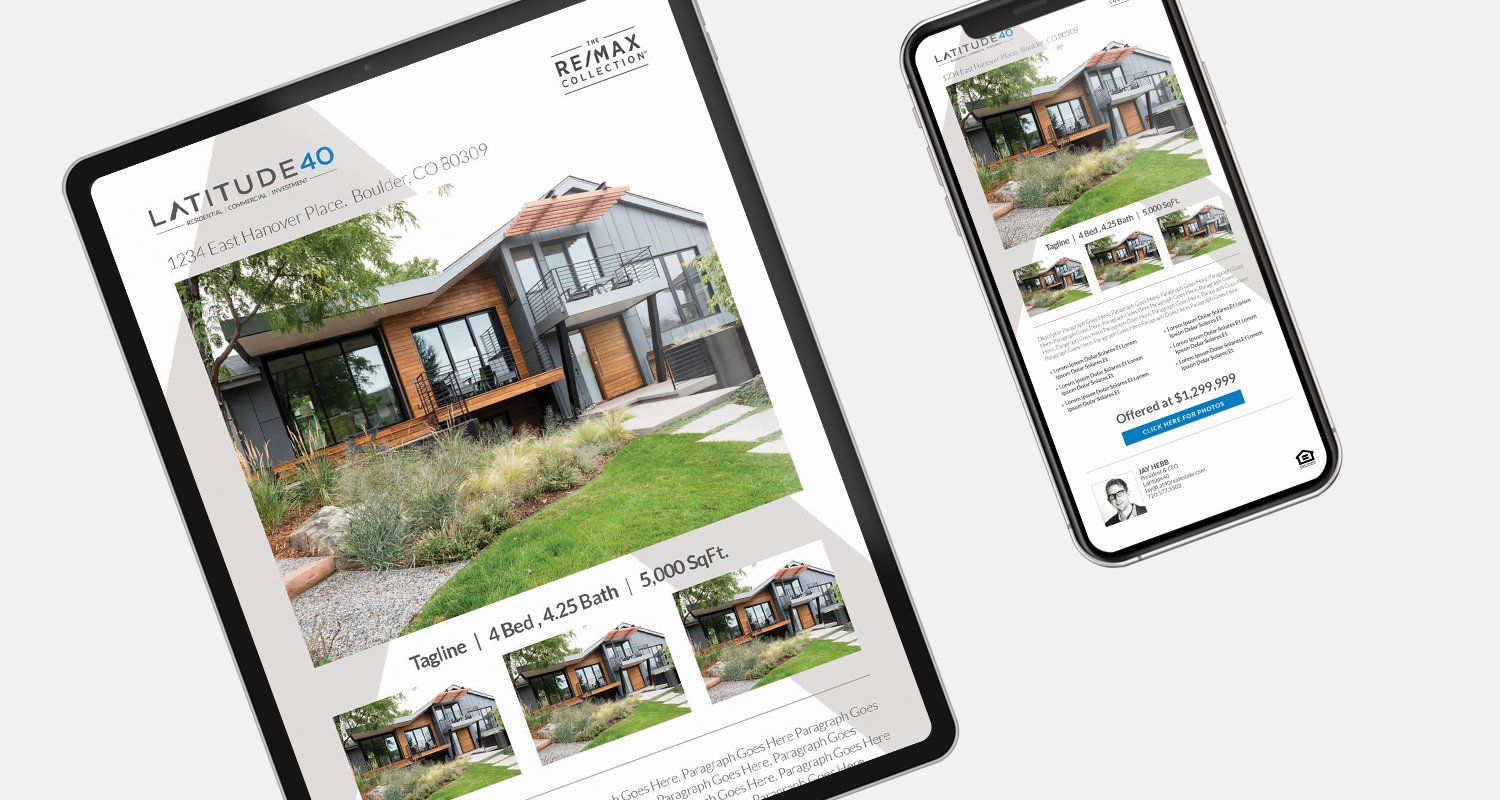


Bringing this 20-year in the making brand to life has been an honor. Every detail is the ideation of the founder himself, Jay Hebb. From helping Jay name his brokerage, to creating signage and finding unique ways to represent his investment, development and residential real estate portfolio with the utmost integrity has been key to developing the Latitute40 brand.
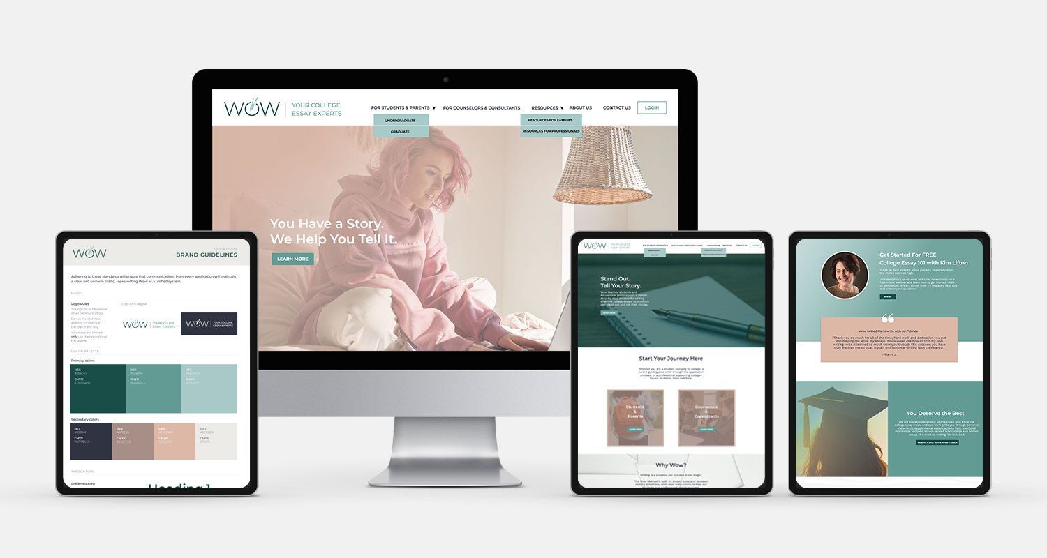
WOW- Your College Essay Experts

Problem
We did a complete brand refresh for Wow, formerly Wow Writing Workshop. They have been in business for over a decade and their existing brand was highly outdated. Plus, they were not communicating what they did because their offering had changed over the years dramatically.
Solution
We interviewed and surveyed stakeholders to determine the ultimate value proposition—Wow is a group of experts in the college essay space, and they help students effectively tell their stories. At the same time, they have an abundance of tools and training for professionals. They have two service offerings and two different audiences, and we helped Wow define this on their website.
Now they have a new tagline, 'Your College Essay Experts,' a portfolio of diverse imagery representing their target audience and university vibe, a unique and elevated standout color palate, and a messaging structure with purpose and impact.
Impact
Wow solely focuses on guiding students to write compelling college essays and providing training and tools to college counselors and consultants. However, they were not communicating this clearly, and we wanted to update its brand to reflect its current services targeting two distinct audiences. So we honed in the brand to focus on—college essay consultation for high schoolers and training and tools for counselors and consultants.
Wow is all around, helping the world be a better place and furthering people's education for years to come!

Jen Scheinman
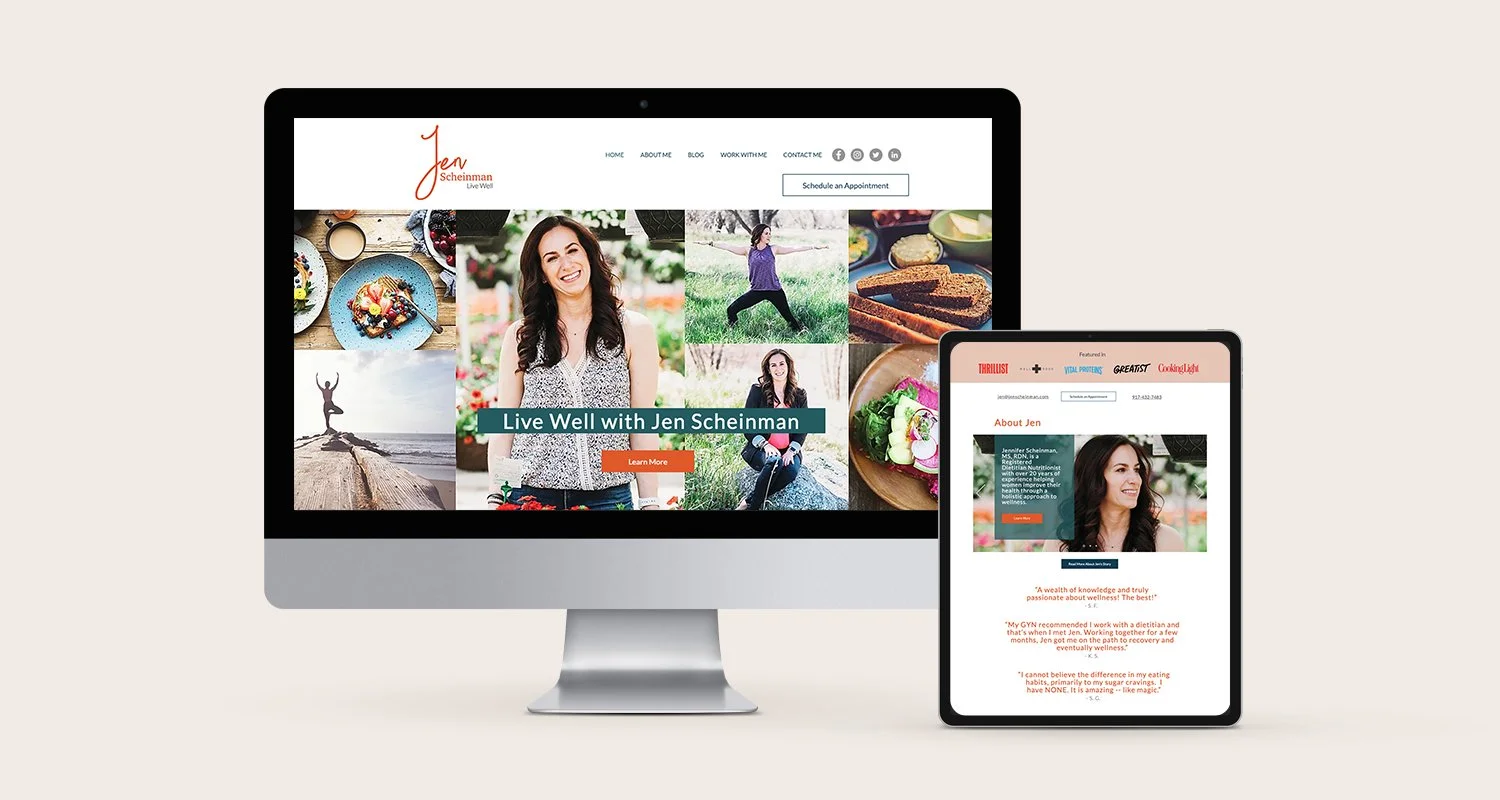
Diving deep into Jen’s vibrant personality and the health and wellness industry, we brought her colorful lively personality to life through professional photography and a fresh energetic style.
Susan Kramer Consulting

We did a complete brand analysis to bring Susan Kramer Consulting's brand to the next level. From "fundraising fairy" to a "fundraising expert," she still shows her flair and fun personality through this brand. However, we wanted to elevate her position from being a fairy to someone who knows her sh##t.
She now has a bold and creative presence, but also still has flair and sparkle. She is now catching the attention of many national nonprofits worldwide who want to work with her coaching and proven methodologies to turn their passion into action.

Springwood Retirement


An established brand since the early 80s, Springwood Retirement Campus needed a modern update. We’re worked with Springwood Retirement Campus to update and freshen up all of their marketing to be simple, impactful and storytelling in nature. The butterfly theme was seen throughout the old branding as well as the campus itself, which inspired us to bring it into the new visual identity .

Regis University


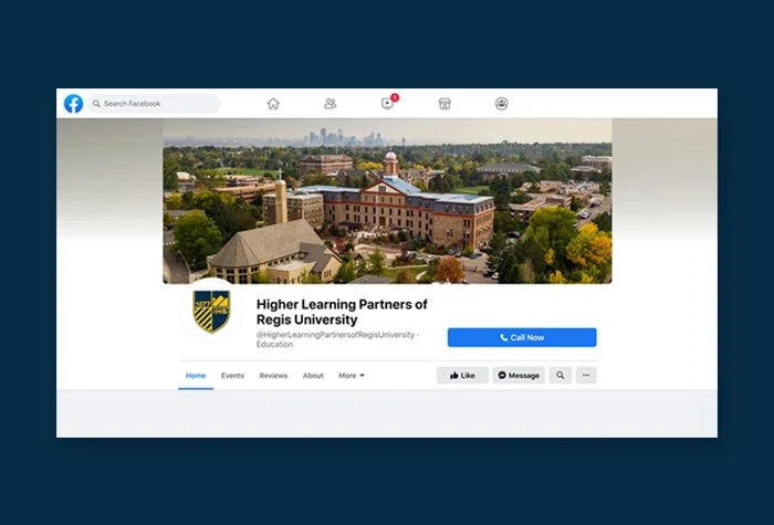
Regis University needed to bring clarity to its higher-ed technology solution platform, which brings online education to other universities and students around the world. We refreshed, clarified and modernized the brand, which was established in 1987.
Kavod v’ Nichum

Problem
Kavod v'Nichum is a non-profit organization that has been serving the Jewish community for over 20 years. While their work of providing resources for Jewish end-of-life rituals and practices is extremely valued, it was time for a brand refresh and new clear messaging. Their original website struggled with direction. It had an extraordinary amount of information—400 pages. Their services became hard to understand and navigate. The website became an internal content repository rather than a storefront of the organization for patrons to browse and find useful information. While their staff was passionate and subject matter experts, they were too confused on their own offerings and mission.
Solution
We identified their three primary services - resources, education, and training - and structured their new website to focus on the value they provide. We honed in their in-depth tab style resources library to seven top-line topics. Now, their website has a clear direction for their patrons to follow. We also consolidated their education and training services under the umbrella education. We also modernized their look. We leveraged deep jewel tones in their new brand identity to symbolize the richness of the Jewish culture, and the depth of life and also grieving. Throughout their website, you can find artistic handdrawn illustrations highlighting end-of-life rituals and practices, giving visual depth to the important information they provide. Most importantly, we helped with their high-level messaging. From their new tagline, Honoring Death in Life, to simplifying who they are and who they serve, we helped simplify their core brand messaging.
Impact
We are extremely proud to work with an organization that services a community so close to our hearts. The only thing that is better than hearing that our clients loved their brand refresh is that THEIR clients love the new look. Check out what Kavod v' Nichum's patrons had to say about their new brand refresh and website design. "Congratulations on the launch of the new website. I really like the refresh - it is so much more inviting."
“The new website looks very nice. May our sacred work continue under the chuppah (canopy) of compassion to guide us."
"What a beautiful new website! These are such important resources to share with the world."
Kavod v’ Nichum has successfully updated all of their marketing collateral, announced their new brand at their annual conference, rolled out the brand to staff and is continues to acquire new patrons and satisfy existing donors and volunteers.